A patient with non-small cell lung cancer starts chemo-immunotherapy. Blood draws at four timepoints — before treatment, then at weeks 3, 6, and 9 — capture snapshots of their immune system. The question buried in those blood draws is simple: is the treatment working?
To understand how the data answers that, we need to talk about T cells.
A Brief Tour of Your Immune System’s Hit Squad
T cells are white blood cells that kill infected or cancerous cells. Each T cell carries a receptor on its surface — a protein shaped to recognize one specific molecular target, like a lock that fits one key. The gene encoding that receptor is randomly generated when the T cell is born, so every T cell gets a unique one.
A clonotype is the family of T cells that all share the same receptor sequence. When a T cell’s receptor recognizes a threat — say, a protein on a tumor cell — that T cell starts dividing. All its daughter cells inherit the same receptor. So a clonotype is a lineage: one original cell that found something worth fighting, and all the copies it made of itself to fight it. In the data, each clonotype is identified by its CDR3 amino acid sequence (the most variable part of the receptor), something like CASSGRYEQYF.
This multiplication is clonal expansion — the immune system’s way of mass-producing the right weapon. If you see 2 cells with a given receptor sequence before treatment and 200 at week 6, that clone expanded. Track the abundance of each clonotype over time, and you’re watching the immune system decide which threats to fight and how aggressively.
Cell states: what a T cell is doing right now
Not all T cells are in the same state, even within the same clonal family. A naive T cell has never encountered its target — it’s dormant, waiting. An effector T cell has been activated and is actively killing. An exhausted T cell has been fighting too long and is losing function (like a soldier who’s been deployed too many times).
You can tell these states apart by which genes each cell is currently expressing. Every cell in your body has the same DNA, but different cells turn different genes on and off. An effector cell cranks up genes for cytotoxic weapons — GZMB and PRF1 encode proteins that literally punch holes in target cells. An exhausted cell turns on inhibitory receptors like LAG3, TIGIT, and PDCD1 (the target of immunotherapy drugs like Keytruda) that act as “off switches,” dampening the cell’s killing ability. A naive cell expresses homing receptors like CCR7 and SELL that keep it circulating through lymph nodes, waiting.
The surface receptor CX3CR1 marks T cells that have reached terminal effector status — fully armed, fully differentiated killing machines. These are the cells the immune system sends when it’s serious.
The critical distinction
A clonotype (receptor sequence) tells you what a T cell recognizes — its target. Gene expression tells you what state it’s in — naive, effector, exhausted. These are independent axes. Two cells from the same clonal family can be in completely different states: one might be an active effector killing tumor cells, while its sibling is exhausted and shutting down. To know what a cell is doing, you need to read its gene expression.
How cells get classified: clustering
When you profile thousands of cells’ gene expression simultaneously, you can group them by similarity. Cells expressing similar genes get clustered together — it’s the same idea as k-means clustering, but on ~2,000-dimensional gene expression vectors. The standard tool for this is Seurat, which builds a nearest-neighbor graph in gene expression space and partitions it into communities.
The result for this dataset: 13 clusters (C0–C12), each representing a distinct cell state. You label each cluster by looking at its defining genes. Abdelfatah et al. explicitly named five of them; the rest can be inferred from their marker genes in the paper’s supplementary tables:
| Cluster | Cell type | Key markers | Notes |
|---|---|---|---|
| C0 | CD4+ T cells (memory/Th2) | GATA3, IL7R, SELL | Most abundant at baseline, declined during treatment |
| C1 | Naive T cells (quiescent) | TCF7, LEF1, SELL, CCR7 | Classic naive markers |
| C2 | CD4+ activated (Th2-like) | GATA3, IL7R, CD69 | Early activation signature |
| C3 | Stress response | FOS, JUN, JUNB, GADD45B | Likely a technical artifact (immediate-early genes) |
| C4 | CX3CR1+ terminal effector CD8+ | NKG7, GZMB, GZMH, PRF1, CX3CR1 | Paper’s key cluster — treatment-responsive killers |
| C5 | Naive/quiescent T cells | TCF7, NLRC5 | Highest TCF7 expression of any cluster |
| C6 | CX3CR1+ terminal effector CD8+ | GNLY, GZMH, NKG7, GZMB, PRF1, CX3CR1 | Same functional class as C4, even more cytotoxic |
| C7 | Naive/memory CD8+ | CD8A, CD8B, LEF1, SELL, CCR7 | Gradually increased during treatment |
| C8 | Early effector CD8+ (GZMK+) | GZMK, CXCR3, KLRB1 | Transitional — activated but not yet terminal |
| C9 | Naive/memory (quiescent) | CCR7, IL7R, BACH2, BCL2 | Survival/quiescence markers |
| C10 | Heat shock / stress | HSPA1A, HSPA1B, DNAJB1 | Likely a technical artifact |
| C11 | Regulatory T cells (Tregs) | FOXP3, CTLA4, TIGIT | Immune suppression, not killing |
| C12 | MAIT / Th17-like | KLRB1, CCR6, RORA | Innate-like T cells |
A quick note on terminology: CD8 and CD4 are surface proteins that define the two main branches of T cells. CD8+ T cells are the cytotoxic (“killer”) subset that directly destroys target cells. CD4+ “helper” T cells coordinate other immune cells rather than killing directly. This dataset contains both types, plus regulatory T cells and other subtypes — it’s the full lymphocyte landscape from the blood draws. The paper’s central finding about CX3CR1 expansion is specifically about the CD8+ T cells in C4 and C6.
The Data: Two Views of the Same Cells
The dataset comes from GEO accession GSE213902, associated with Abdelfatah et al. (2023). One NSCLC patient, four timepoints:
- Pre-treatment (1,861 cells)
- Week 3 (223 cells)
- Week 6 (1,556 cells)
- Week 9 (1,236 cells)
Each cell was profiled with two technologies simultaneously:
scRNA-seq (single-cell RNA sequencing) measures which genes each cell is expressing — its molecular state. Are the killing genes turned on? The exhaustion genes? The naive genes? Across 4,876 cells and ~18,000 genes, this tells you what every cell in the blood sample is doing. This is how the 13 clusters above were defined.
TCR-seq (T-cell receptor sequencing) reads the receptor sequence of each cell — its clonotype identity. This tells you which clonal family each cell belongs to. Across 2,541 unique clonotypes at four timepoints, this tells you which families are expanding (the immune system is deploying them) and which are contracting (being displaced).
The same cell has both measurements. That’s the power of this dataset: you can find which clonotypes expand using TCR data, then look up those exact cells in the scRNA data and ask what cluster are they in? What genes are they expressing? Are they effectors or something else?
Abdelfatah et al. (2023) used this data to show that when the fraction of CX3CR1+ CD8+ T cells increased by 10% or more from baseline to week 6, the patient was responding to treatment. This “CX3CR1 score” predicted treatment response with 85.7% accuracy across their cohort. The pattern was clear: chemo-immunotherapy drives clonal T cell expansion, and the degree of CX3CR1+ effector expansion tracks with whether the treatment is working.
Our question was different. Could a matrix factorization algorithm — given only the raw clonotype frequency data, no labels, no CX3CR1 annotation, no prior knowledge of which timepoint matters — independently rediscover the week 6 peak?
Why NMF?
Non-negative Matrix Factorization decomposes a matrix $V$ into two smaller matrices:
$$V \approx W \times H$$
where $V$ is $n \times p$ (rows $\times$ columns), $W$ is $n \times k$, and $H$ is $k \times p$. The number $k$ is the rank — how many “patterns” or “factors” you want to find. The constraint: every entry in $W$ and $H$ must be non-negative ($\geq 0$).
For our TCR matrix: $V$ is 416 clonotypes $\times$ 4 timepoints. Setting $k = 3$:
- $H$ is $3 \times 4$ — three temporal patterns. Each row of $H$ describes how one factor behaves across the four timepoints. If Factor 3’s row reads
[low, medium, high, medium], that’s the “peaks at week 6” pattern. - $W$ is $416 \times 3$ — clonotype memberships. Each row of $W$ tells you how much each clonotype belongs to each factor. If clonotype
CASSGRYEQYFhas $W$ values[0.1, 0.0, 0.7], it loads heavily on Factor 3 — it follows the “peaks at week 6” pattern. This value (0.7) is called the loading: how strongly a clonotype participates in a given factor.
The product $W \times H$ reconstructs the original matrix. NMF finds the $W$ and $H$ that minimize the reconstruction error — the difference between $V$ and $WH$.
Why NMF and not PCA or SVD?
Three reasons, all tied to the biology:
Non-negativity matches the data. Clonotype frequencies are percentages — they can’t be negative. Gene expression counts can’t be negative. PCA and SVD allow negative values in their components, which means a “pattern” might say a gene is expressed at $-3$. That’s mathematically valid but biologically meaningless. NMF’s non-negativity constraint ensures every pattern is a physically possible expression or frequency profile.
Parts-based decomposition. Lee & Seung (1999) showed that the non-negativity constraint forces NMF to learn parts of the data rather than holistic modes. PCA finds directions of maximum variance that can cancel each other out (one component adds while another subtracts). NMF finds additive building blocks that combine to produce the observed data. In our case: three temporal behaviors that add up to explain the full repertoire dynamics. Each factor represents a real, interpretable program — not a mathematical abstraction that mixes positive and negative contributions.
The biology is additive. The total T cell repertoire at any timepoint is literally the sum of all clonal families. Expanding clones add to the total; contracting clones contribute less. This additive structure is exactly what NMF models. Each clonotype’s trajectory is a weighted sum of the $k$ temporal patterns: some weight on the “stable” pattern, some on the “contracting” pattern, some on the “expanding” pattern. That’s $V \approx WH$ in biological terms.
Why is k limited to 2 or 3?
The rank $k$ cannot meaningfully exceed the number of columns $p$. Our matrices have $p = 4$ columns (Pre, Wk3, Wk6, Wk9):
- $k = 1$: Trivial — one factor that’s just the weighted average of everything. No structure learned.
- $k = 2$ or $3$: The useful range. NMF compresses 4 timepoints into fewer factors, and that compression reveals structure.
- $k = 4$: As many factors as columns. NMF can represent each timepoint as its own factor, achieving near-zero error without learning any shared structure. It’s memorization, not pattern discovery.
- $k > 4$: Degenerate. $H$ would be $k \times 4$ with rank at most 4, so some factors must be linear combinations of others. It’s like fitting a degree-5 polynomial to 4 data points — zero error, but the curve between the points is meaningless.
This is a fundamental constraint of having only 4 columns. More columns (like the 52-column cluster-level matrix discussed in Next Steps) would allow higher ranks and potentially richer factor discovery.
What the Previous Student Did
A previous student built the initial preprocessing pipeline. They prepared two matrices for NMF:
- A scRNA pseudobulk matrix: average gene expression across all cells at each timepoint, producing a genes $\times$ 4 matrix. This collapses 4,876 individual cells into 4 summary columns — one per timepoint, following standard pseudobulk methodology.
- A TCR frequency matrix: clonotype percentages at each timepoint, a clonotypes $\times$ 4 matrix.
We reproduced his code step by step — matching his output CSVs to machine precision (maximum difference: $5.33 \times 10^{-15}$) — before changing anything. Reproduction first, then improvement.
Four problems surfaced:
Double log-normalization. The original code called AverageExpression(slot="data") on Seurat’s RNA assay, which returns values that are already log-normalized ($\log(1 + \frac{\text{count}}{\text{total}} \times 10000)$). It then applied NormalizeData("LogNormalize") on top, computing:
$$\log\Big(1 + \frac{\log(1 + x)}{S} \times 10000\Big)$$
where $S$ is the column sum of the already-logged values. This compresses the dynamic range: a gene with true expression ratio of 10$\times$ becomes ~1.3$\times$ after double-log. NMF can’t distinguish real differences from noise when everything is squished together. The compression doesn’t just reduce signal — it destroys the relative ordering that NMF relies on to separate factors.
RNA assay instead of SCT. The Seurat object contains an SCTransform assay with variance-stabilized values. Why does this matter? In raw scRNA-seq data, a gene detected in 2 cells vs 0 cells looks like an infinite fold-change, while a gene expressed in 1,000 vs 800 cells (a real 25% change) looks modest. SCTransform fits a statistical model (regularized negative binomial regression) that learns the expected variance at each expression level and returns residuals — “how surprising is this gene’s expression given what we’d expect?” This puts all genes on a comparable scale, so NMF doesn’t get dominated by a few high-count genes. The original pipeline used the default RNA assay instead, likely because most tutorials use it.
Averaging in log space. Averaging already-log-transformed values gives the geometric mean, not the arithmetic mean. To see why this matters: $\text{mean}(\log(100), \log(0)) = \log(10)$, which back-transforms to 10. But the arithmetic mean of 100 and 0 is 50. The geometric mean systematically underestimates highly-expressed genes, which are exactly the ones that carry the most NMF signal.
No feature selection. All 17,857 genes were included. The vast majority are housekeeping genes (always on, regardless of cell state — think ribosomal proteins that every cell needs for basic protein synthesis), undetected genes, or genes too sparse to be informative. NMF with $k = 3$ has only 3 factors to explain the entire matrix — that’s $3 \times 4 = 12$ parameters in $H$ to approximate 17,857 $\times$ 4 = 71,428 values. Including 15,000 noise rows forces each factor to be a blurry compromise between signal and nothing.
Fixing the Preprocessing
We fixed each problem one at a time, measuring the impact of each change independently — a principle we held throughout the project. Every variant was run through the same R NMF algorithm (Lee & Seung multiplicative updates, $k = 2$ and $k = 3$, 10 random starts) so errors were directly comparable.
We measured error using Normalized Mean Absolute Error (NMAE): scale each matrix to $[0, 1]$, compute $\sum|V - WH|$, divide by the number of elements. This is the fairest comparison across matrices with different value ranges — a matrix with values in $[0, 560]$ would have larger raw error than one in $[0, 6]$ simply because the numbers are bigger, not because the fit is worse. NMAE controls for this. It’s also what the production algorithm MEGPath effectively optimizes, since it normalizes inputs to $[0, 1]$ internally.
Feature selection was the biggest lever. Filtering from 17,857 genes to the top 2,000 highly variable genes (HVGs) — genes whose expression actually changes across conditions, as opposed to housekeeping genes that stay flat — produced the largest single error reduction. A gene count sweep (500, 1,000, 2,000, 3,000, 5,000 HVGs) confirmed that 2,000 sits at the NMAE minimum, validating the field convention. Of our 16 key biology genes (CX3CR1, GZMB, PRF1, NKG7, exhaustion markers, etc.), 14 were captured in the top 2,000 HVGs.
The final improved scRNA matrix: SCTransform-normalized, 2,000 HVGs, properly averaged. Error per element dropped 47% compared to the original baseline, and the production algorithm ran 10$\times$ faster (3 minutes vs 42 minutes for 100K iterations) because the matrix was 9$\times$ smaller.
TCR required a different fix. The problem wasn’t normalization — it was sparsity. 96% of the 2,541 clonotypes appear at only one timepoint. A clonotype detected only at week 6 and nowhere else has a row like [0, 0, 0.3, 0] — NMF can trivially reconstruct that (just put all the weight on the week-6 column of $H$), but learns nothing about temporal dynamics. There’s no trajectory to decompose. We tested three filtering strategies and settled on Filter C: keep only clonotypes marked as “Expanded” or “TIL-observed” (found in tumor-infiltrating lymphocytes) in the paper’s supplementary Table S8. This yielded 416 biologically relevant clonotypes — the ones the immune system actually deployed.
We also investigated an earlier approach of adding Fisher exact test p-value columns to the matrix (7 columns instead of 4). The idea was that statistical significance of expansion might carry information beyond raw frequency. But linear regression showed $R^2 > 0.95$ between the p-value columns and the existing frequency columns — the p-values are deterministic functions of the same count data (frequency = count / total, and the totals per timepoint are constants), not genuinely new information. Adding redundant columns would only increase $k$’s ceiling and invite overfitting. We proceeded with the cleaner 4-column frequency matrix.
The chart below compares MEGPath reconstruction error across every matrix variant we tested. On the left, scRNA: the original baseline (17,857 genes $\times$ 4 timepoints) vs our improved matrix (2,000 HVGs $\times$ 4 timepoints). Same number of columns, 9$\times$ fewer rows, but 47% lower error per element — the removed rows were noise that NMF was wasting capacity trying to fit.
On the right, TCR: the original baseline (2,541 clonotypes $\times$ 4 timepoints) vs our bio-filtered matrix (416 clonotypes $\times$ 4 timepoints). Here the error increases after filtering, which looks counterintuitive until you consider what was removed. Of those 2,541 original clonotypes, 96% appear at only one timepoint — their rows look like [0, 0, 0.3, 0]. NMF reconstructs these trivially by assigning all weight to the corresponding timepoint’s column. We verified this directly: single-timepoint clonotypes have a median per-row error of 0.000148, while multi-timepoint clonotypes have a median error of 0.0205 — 139$\times$ higher. The mean error ratio is 6.9$\times$. Removing those easy rows leaves only the 416 clonotypes with actual multi-timepoint trajectories, which are genuinely harder to compress into $k$ factors. Higher error per element, but the error now reflects real decomposition difficulty, not the algorithm coasting on trivial zeros.
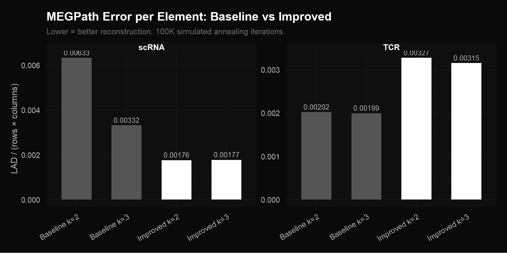
MEGPath reconstruction error per element across all configurations. Left: scRNA — improved preprocessing (2,000 HVGs) cuts error by 47% vs baseline (17,857 genes). Right: TCR — bio-filtered (416 clonotypes) has higher per-element error than baseline (2,541 clonotypes) because the trivially-reconstructible zero rows were removed, leaving only genuine multi-timepoint signal.
What MEGPath Found
The production NMF algorithm was MEGPath — a C++ implementation that uses Monte Carlo Markov Chain with simulated annealing to minimize Least Absolute Deviation ($\sum|V - WH|$). Simulated annealing is useful here because NMF’s optimization landscape has many local minima — unlike gradient descent, which can get stuck, simulated annealing can occasionally accept worse solutions to escape local traps and explore more of the landscape. We compiled it locally and ran 100,000 iterations per configuration.
scRNA: A Null Result (and Why That’s Good Science)
The improved scRNA pseudobulk matrix produced perfectly flat $H$ matrices. Factor weights at Pre, Wk3, Wk6, and Wk9 were identical to three decimal places. NMF found zero temporal variation.
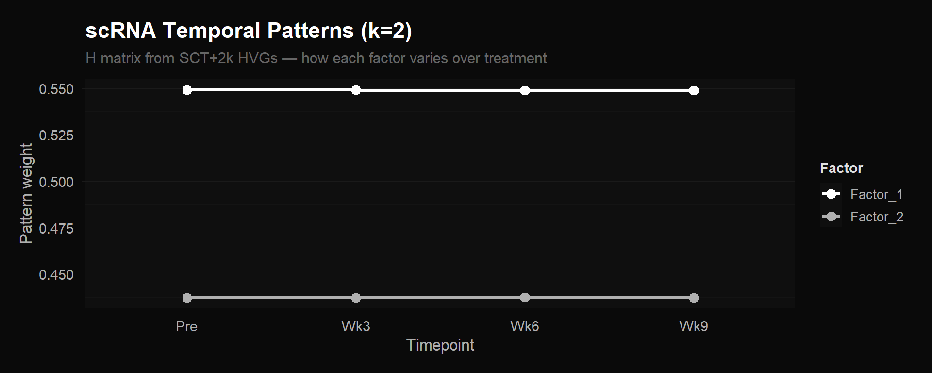
scRNA $H$ matrix ($k = 2$). Both factors are flat lines — no temporal signal in pseudobulk averages.
This doesn’t mean gene expression doesn’t change during treatment. It means that averaging all ~4,876 cells per timepoint into a single column buries the signal. Remember, the expanding CX3CR1+ effectors are a few hundred cells out of thousands at each timepoint. When you average them together with the much larger number of naive, memory, and bystander cells that aren’t changing, the effectors’ contribution barely moves the mean. The pseudobulk column for week 6 looks almost identical to pre-treatment, because the 200 cells that changed are drowned out by the 1,300 that didn’t.
An alternative explanation worth noting: SCTransform’s variance stabilization might itself compress temporal contrasts that NMF needs. The definitive test is cluster-level pseudobulk (discussed in Next Steps).
We deliberately started with this simplest possible approach — average everything, run NMF, see what happens. The flat $H$ matrices told us that the 4-column pseudobulk design is the bottleneck, not the algorithm and not the normalization. Without trying it, we wouldn’t know whether the preprocessing fixes were sufficient on their own or whether the matrix design itself needed to change.
Interestingly, the baseline appeared to show temporal variation — factors crossing and diverging dramatically across timepoints. But this was noise fitting, not biology. The original 17,857-gene matrix (double-log normalized, RNA assay, no feature selection) included thousands of non-variable genes that add random structure, and the double-log transformation distorted relative magnitudes. MEGPath was fitting this noise.
The comparison below puts both $H$ matrices side by side — same algorithm, same 100K iterations, same 4 timepoints. The only difference is the input matrix: 17,857 $\times$ 4 (baseline) vs 2,000 $\times$ 4 (improved). The baseline ran at $k = 3$ because the extra noise rows gave the illusion of supporting three factors; the improved matrix, being honest about its information content, was best fit at $k = 2$.
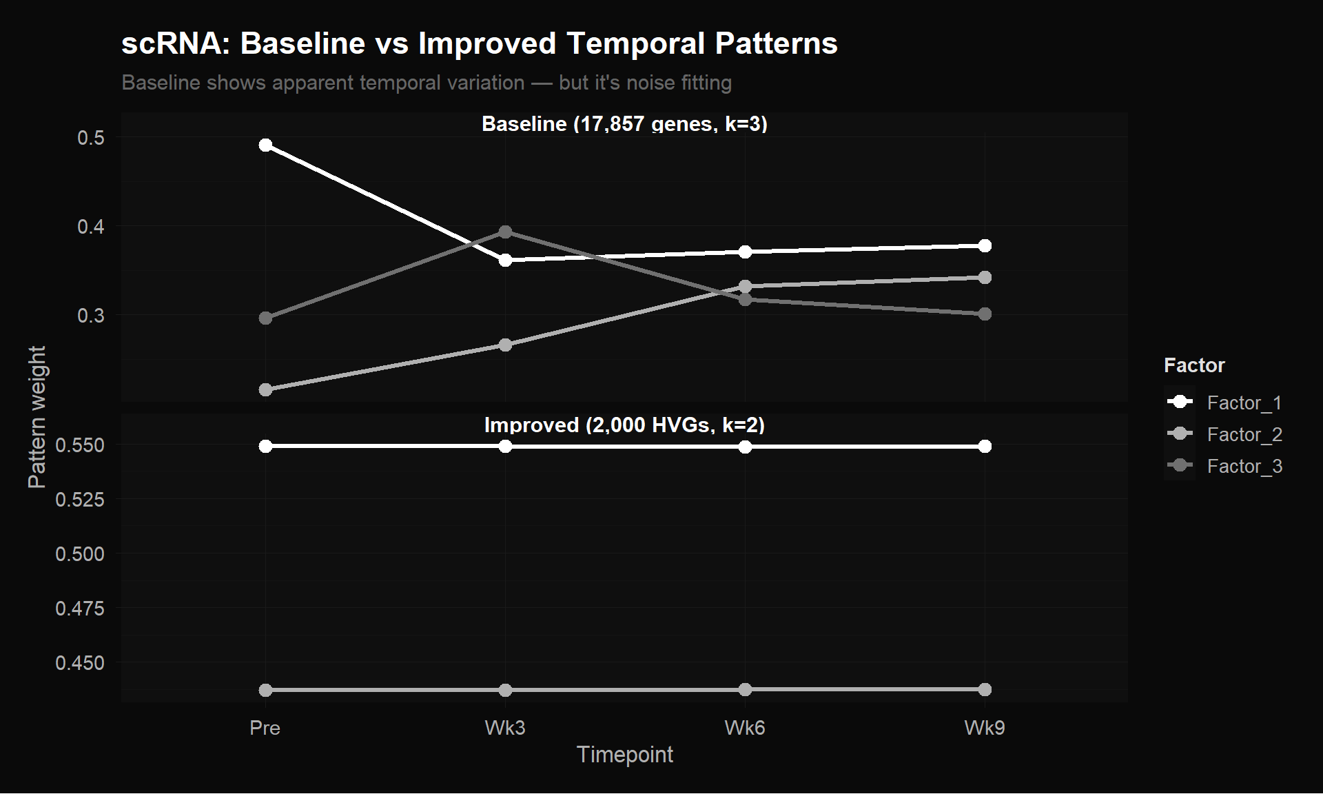
Top: Baseline $H$ matrix (17,857 genes $\times$ 4 timepoints, $k = 3$) shows apparent temporal variation — but it’s noise fitting. Bottom: Improved $H$ matrix (2,000 HVGs $\times$ 4 timepoints, $k = 2$) is honest about the lack of signal. Lower error + flat patterns is more trustworthy than higher error + dramatic patterns.
It would have been tempting to interpret the baseline’s dramatic patterns as biology. Our improved matrix, with lower reconstruction error, showed flat lines. The baseline “patterns” were artifacts from bad preprocessing. You have to try the simple approach, find the null, and understand why it’s null before you can design the fix.
TCR: Three Temporal Programs
This is where the biology is. Unlike scRNA’s pseudobulk averaging (which blends all cell types together into one number), the TCR matrix tracks each clonotype individually. If a clonal family is expanding, that signal doesn’t get diluted — it shows up directly as rising frequency.
We ran MEGPath on our bio-filtered TCR matrix: 416 clonotypes $\times$ 4 timepoints, where each entry is the frequency (proportion of total T cells) of that clonotype at that timepoint. These 416 clonotypes are the ones marked as “Expanded” or “TIL-observed” in the paper’s supplementary data — the biologically active portion of the repertoire, with the 2,125 single-timepoint clonotypes removed. At $k = 3$, the $H$ matrix is $3 \times 4$: three temporal patterns across four timepoints.
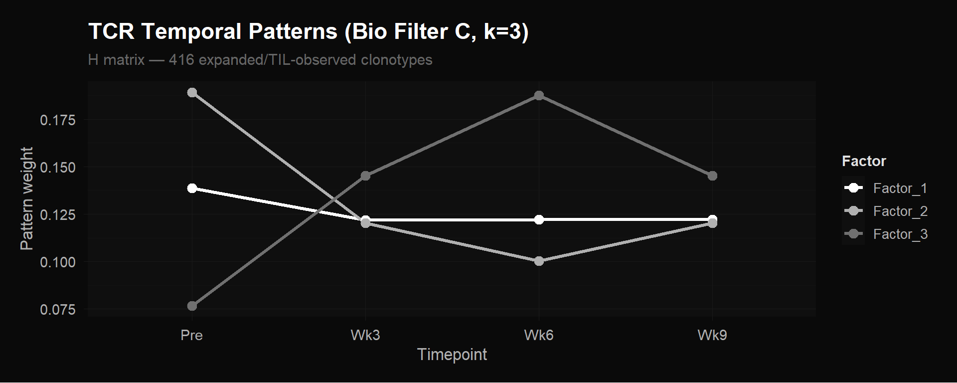
TCR $H$ matrix (Bio Filter C, 416 clonotypes $\times$ 4 timepoints, $k = 3$). Three distinct clonotype expansion programs emerge from unsupervised factorization. Each line is one row of $H$ — one temporal pattern.
NMF discovered three biologically distinct clonotype behaviors from the 416 expanded/TIL-observed clonotypes:
Factor 1 — Stable/persistent. Roughly constant frequency across all four timepoints. These are memory or homeostatic clones unaffected by therapy — their target isn’t related to the tumor, so the treatment doesn’t change their abundance.
Factor 2 — Pre-treatment dominant, contracting. Highest at baseline, drops sharply during treatment. These are bystander clones being displaced as treatment-responsive clones expand. The T cell repertoire is a zero-sum game: frequencies must sum to 100% at each timepoint, so when some families grow as a fraction of the total, others must shrink.
Factor 3 — Treatment-responsive expansion. Low or absent pre-treatment, rises through week 3, peaks at week 6, then partially contracts by week 9. These are the clonotypes the immune system is actively deploying against the tumor. This is the key result.
The week 6 peak in Factor 3 is exactly the timing that Abdelfatah et al. identified as predictive of treatment response. NMF found it from frequency data alone — no CX3CR1 annotation, no response labels, no prior hypothesis about which timepoint matters.
The $H$ matrix tells you the temporal shape of each factor. To see which clonotypes follow each shape, we look at $W$: for each factor, take the 5 clonotypes with the highest $W$ loading and plot their actual frequency trajectories (raw data, not the NMF reconstruction) across the four timepoints.
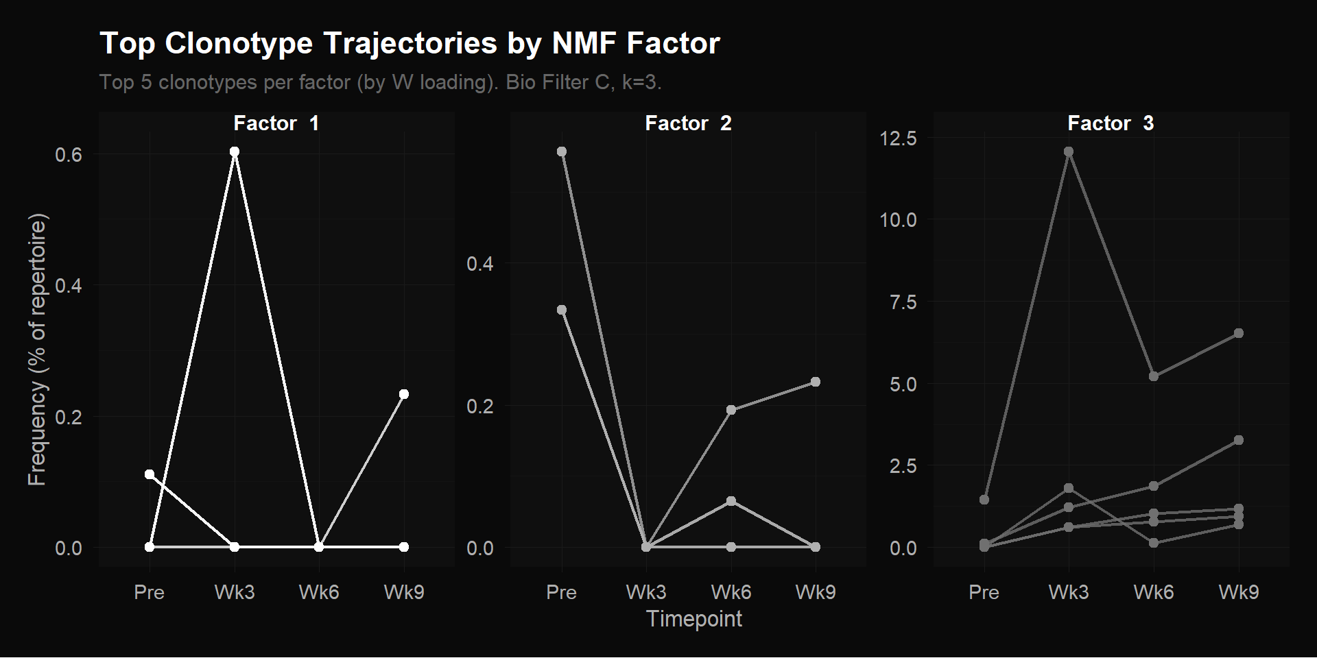
Top 5 clonotypes per factor by $W$ loading. Each line is one clonotype’s raw frequency (% of total repertoire) across 4 timepoints. Note the y-axis scales: Factor 1 and 2 max out around 0.5%, while Factor 3 reaches 12.5% — the treatment-responsive clonotypes are 20$\times$ more abundant.
Each panel shows a different story. Factor 1’s top clonotypes hover near zero with one brief spike at Wk3 — transient appearances, not sustained expansion. Factor 2’s top clonotype starts at ~0.5% pre-treatment and drops to near zero — these were present before therapy and got displaced as treatment-responsive clones expanded. The T cell repertoire is zero-sum: frequencies must add to 100% at each timepoint, so when some families grow, others shrink as a proportion.
Factor 3 is where the biology is. The y-axis scale jumps to 12.5% — these clonotypes are orders of magnitude more abundant than the other groups. The dominant clone surges from near-zero pre-treatment to 12.5% of the entire repertoire at Wk3, then tapers through Wk6 and Wk9 — but the other four clonotypes are still expanding through Wk9, their frequencies rising or holding steady. The overall shape: low pre-treatment $\to$ rapid expansion $\to$ sustained or still growing. These are the clonotypes the immune system mass-produced in response to treatment.
What This Means
We selected six clonotypes from the supplementary data as the most prominent expanded, TIL-observed clones — the ones with the highest cell counts and tumor infiltration frequencies. All six were assigned to Factor 3 by NMF. Every single one.
The most striking case is CASSGRYEQYF. It has the highest TIL frequency in the dataset (0.41% of tumor-infiltrating lymphocytes) — meaning it’s the most abundant treatment-responsive clone actually found inside the tumor itself. NMF assigns it almost exclusively to Factor 3 (loading: 0.673) with near-zero loading on Factor 2 (0.002). The algorithm correctly identified the dominant tumor-infiltrating clone as belonging to the treatment-responsive expansion program, using only peripheral blood frequencies.
We can’t yet say Factor 3 is the CX3CR1+ expansion program — that would require the linkage step (mapping these clonotypes to scRNA clusters C4/C6 and confirming they express CX3CR1). What we can say: Factor 3’s temporal pattern matches the paper’s CX3CR1 finding (week 6 peak), and the clonotypes NMF assigns to it are exactly the ones the paper flagged as expanded and tumor-infiltrating. The circumstantial evidence is strong, but confirmation requires connecting the TCR and scRNA data.
The scRNA null result is equally informative. It tells us that pseudobulk averaging — collapsing thousands of heterogeneous cells into one number per gene per timepoint — isn’t sufficient to capture temporal dynamics driven by specific cell subpopulations. The expanding CX3CR1+ effectors are a few hundred cells out of ~1,500 at week 6. Their gene expression changes get swamped by the majority of cells that aren’t changing. The signal is there (the TCR data proves it), but the matrix design buries it. The fix is to preserve cell-type resolution.
Next Steps
Cluster-level pseudobulk
Instead of averaging all cells per timepoint into one column, average within each of the 13 cell-type clusters separately. This yields a 2,000 $\times$ 52 matrix (genes $\times$ [4 timepoints $\times$ 13 clusters]) that preserves within-timepoint heterogeneity. If the CX3CR1+ effector clusters (C4, C6 from the paper) show gene expression changes over time that other clusters don’t, NMF should discover them as distinct factors. This is the definitive test of whether the flat scRNA result was a matrix design limitation or a genuine absence of signal.
With 52 columns instead of 4, the rank ceiling rises from $k = 3$ to $k < 52$ — the exact optimal rank would be determined by rank selection methods like cophenetic correlation, but the point is that NMF now has room to discover far more granular programs. The tradeoff: some cluster-timepoint combinations may have very few cells (cluster C8 at week 3 might have 5 cells), making those averages noisy.
Link TCR factors to scRNA clusters
This is the step that connects the two data modalities. NMF on TCR data told us which clonotypes expand (Factor 3). Now we want to ask: what kind of cells are they?
Since every cell has both a TCR sequence and a gene expression profile, we can look up the cells carrying Factor 3 receptor sequences in the scRNA data and check which clusters they fall into. The hypothesis: Factor 3 clonotypes should be enriched in the CX3CR1+ effector clusters (C4, C6). If so, it confirms that the expanding clones — identified purely from frequency dynamics — are the cytotoxic killers, confirmed independently by their molecular state.
But this mapping won’t be a clean one-to-one correspondence, and it’s important to understand why. The 13 clusters are defined by gene expression state (what a cell is doing right now). The 3 NMF factors are defined by expansion dynamics over time (how a clonotype’s frequency changes). These are different axes. A single clonotype can have cells scattered across multiple clusters — some cells in that family differentiated into effectors while others remain naive. And a single cluster contains many different clonotypes with different expansion patterns.
So the question isn’t “does cluster C4 = Factor 3?” It’s: “are cells belonging to Factor 3 clonotypes disproportionately found in clusters C4 and C6?” It’s a statistical enrichment, not a 1-to-1 assignment. If the enrichment is strong — say, 70% of Factor 3 cells land in effector clusters vs 20% of Factor 1 cells — that’s compelling evidence that expansion dynamics and cell state are coupled in the way the biology predicts.
MEGPath constraint feature
Remember that $H$ is the $k \times 4$ matrix where each row is a temporal pattern. In our $k = 3$ run, NMF discovered all three rows from scratch — stable, contracting, expanding. MEGPath has a feature that lets you lock one row of $H$ to specific values before running the optimization. Instead of discovering all 3 patterns, you fix row 1 to the known CX3CR1+ expansion trajectory and let NMF figure out the remaining 2 rows freely. Where do those fixed values come from? Two options: (1) take the CX3CR1 score (fraction of CX3CR1+ CD8+ T cells) at each timepoint directly from the paper’s supplementary data and normalize to $[0, 1]$, or (2) use the $H$ row that NMF already found for Factor 3 in our unsupervised run — the algorithm’s own estimate of the expansion shape. Either way, you get a 4-element vector encoding “low at Pre, peaks at Wk6.”
Why would you do this? First, it anchors the factorization. NMF is non-convex — different random initializations can give different solutions. Sometimes the “expanding” pattern might get split across two factors, or merged with the “stable” pattern. Fixing one factor to the known biology removes that ambiguity. The other factors are forced to explain whatever’s left after accounting for the expansion pattern, which may produce cleaner, more interpretable results.
Second, it tests a hypothesis. If you fix the CX3CR1 trajectory and NMF still achieves low reconstruction error, it confirms that pattern is real structure in the data, not an artifact of a particular random start. If error goes up substantially, it means that specific trajectory shape doesn’t actually fit the data well — the unsupervised version found something better.
This is “semi-supervised” NMF: you give the algorithm partial knowledge (one known pattern) but let it discover the rest unsupervised. Fully unsupervised = discover everything from scratch (what we did). Fully supervised = specify all patterns (not useful — you’d just be checking a fit). Semi-supervised sits in between, combining prior biological knowledge with data-driven discovery.
Stability testing
MEGPath uses stochastic optimization (simulated annealing), so each run produces slightly different $W$ and $H$ matrices depending on the random initialization. Running multiple independent optimizations per configuration and measuring the consistency of factor assignments via cophenetic correlation — a measure of how often the same clonotypes get grouped into the same factor across runs — would quantify how robust these findings are. High cophenetic correlation means the factors are real structure in the data; low correlation means they might be artifacts of a particular random start.
Notebooks
The full analysis — code, figures, and narrative — is available as four self-contained HTML notebooks. Each includes detailed prose explaining the methodology, code folding for readability, and a dark theme for late-night biology.
Script 01: Reproduce & Understand the Original Preprocessing — Trace the original pipeline line by line, verify CSV reproduction, identify the four preprocessing problems.
Script 02: Improved scRNA Preprocessing — Fix each issue one at a time, measure error impact, run the gene count sweep, export improved matrices for MEGPath.
Script 03: Improved TCR Preprocessing — Quantify the sparsity problem, test filtering strategies, evaluate p-value column redundancy, export filtered TCR matrices.
Script 04: MEGPath Production Results — Parse MEGPath output, visualize H and W matrices, compare baseline vs improved, interpret the three TCR temporal programs.